¶ Introduction
Have you ever been in a situation where you were asked by your boss to analyze a set of data and make a prediction based on it? Well, if not then how about picture this situation: you've been collecting the data from your routers, servers, storage for the past 6 months but still have no clue on what to do with those data.
Sounds familiar with these? or ever been in one of those situations before? Well if the answer is "yes" then here's a hint: how about making a trend prediction? By doing trend prediction and analysis you would be able to 'predict' where and when a certain value will hit on a certain date with a degree of certainty.
¶ Data Analysis
You must be asking how would I do that? Well, say hello to Statistics. By definition (based on Wikipedia) : "Statistics is the study of collection, organization, analysis and interpretation of data". In that sense, only by analyzing the existing data, you would be able to construct new data points and this process is called Extrapolation.
Extrapolation is actually a by-product result of curve-fitting. Curve-fitting itself is a process of constructing a mathematical function that can create the best fit to a series of data points. This would literally mean that the process would create a model function where all the data points would fit together on that model.
Based on the data behaviour, curve-fitting can be categorized into two:
- Linear curve-fitting (for linear data: Least-Square, Root-Square, etc)
- Non-Linear curve-fitting (for non linear data: Polynomial, Conic, Frech Curve, etc)
Since the focus of this writing is only to apply simple statistics to more practical day-to-day scenarios then there won't be any discussion about the non-linear ones.
¶ The Tools
Fortunately, there are few tools (freely downloadable & open source) that can do statistics analysis & curve fitting at the same time. They are:
The tools are full-blown mathematical software where you can do all the fancy mathematical stuff and more than just create a statistic analysis. Then here comes the question: "Do we need all these full-blown Mathematical tools for predicting a linear data set?" The answer is: “No".
Learning all those tools might be a bit challenging given that we're only using a small portion of their features. The good news is there's a less intimidating tool that can do comparatively the same function but not as overkill as the ones listed above.
¶ RRDTool
The tool's name is RRD, as for those who are working in IT this name sounds very familiar especially since this tool has been used for graphing the data for bandwidth, storage capacity, number of concurrent users, etc. This open source tool is so common and popular that it became the "Standard De Facto" for graphing.
This brings into my point, that rather than learning a new set of full-blown tools, why don't we just fully maximize the existing one which we used on an everyday basis and has become the "De Facto" standard.
¶ RRDTool Documentation
Before proceeding to the next section, I am assuming that the audience is well aware of what RRDTool is for and how it works, especially given that most of the audience on this BLESK site are working in IT and fully aware of what RRD can do. But for those who are not familiar with RRDTool, fear not, as the project itself has already been matured and so did with its documentation. For those who are still new to RRD, a good RRD tutorial can be found on this link. Also, a good knowledge of RPN (Reverse Polish Notation) might come in handy as well, as RPN is being used heavily in RRD especially for data calculation, operator function, and logic flows. RPN tutorial can also be found on this link.
¶ RRDTool Statistic Functions
While scouring through the RRDTool documentation, I've stumbled across these very interesting functions: LSLINT, LSLSLOPE, PREDICT & PREDICTSIGMA on this page. After I went looking on different places on the Internet, I finally found these two websites that can be used as references for those functions.
¶ Generating The Trend Prediction with RRDTool
Predicting the data trend with RRD can be done in two ways:
- Trend prediction using a linear data set
- Trend prediction using a non-linear data set
¶ Trend Prediction using a linear data set
For a linear data set, a least-square method is being used. According to the least-square method a linear line always follows this function:
y = a(x) + bWhere "a" denotes the gradient or the slope of the line and "b" is the constant value of the function (or some people call this “y-intercept"). Fortunately these variables can be derived from the following functions in RRD.
LSLOPE = "a" which denotes the slope of the line ( or gradient )
LSLINT = "b" which denotes the constant value of the function ( or "y-intercept")
LSLOPE and LSLINT are deduced from the rrd data via the least-square method (note: assuming that the data being projected is 'linear')
To see this in real, please look at the following script: (spoiler alert : you need to be familiar with rrdtool and RPN -reverse polish notation- first before be able to understand this).
1: #!/bin/sh
2: rrdtool graph proc_util_LSL.png \
3: --imgformat=PNG \
4: --start=-4w \
5: --end='+2m' \
6: --upper-limit=100 \
7: --title="Monthly Number of Processes on `uname`" \
8: --font TITLE:12: \
9: --units-exponent=2 \
10: --vertical-label="Processes" \
11: --height=250 \
12: --width=600 \
13: DEF:a="proc_util.rrd":proc:AVERAGE:step=300 \
14: DEF:a1="proc_util.rrd":proc:MAX:step=300 \
15: DEF:a2="proc_util.rrd":proc:MIN:step=300 \
16: DEF:a3="proc_util.rrd":proc:LAST:step=300 \
17: CDEF:idle=a,0.00,EQ,INF,0,IF \
18: VDEF:avg=a,AVERAGE \
19: VDEF:slope=a,LSLSLOPE \
20: VDEF:cons=a,LSLINT \
21: CDEF:lsl2=a,POP,slope,COUNT,*,cons,+ \
22: CDEF:pred=lsl2,90,100,LIMIT \
23: VDEF:minpred=pred,FIRST \
24: VDEF:maxpred=pred,LAST \
25: GPRINT:a:AVERAGE:"No. of Processes Avg\: %8.0lf" \
26: GPRINT:a1:MAX:"Max\: %8.0lf" \
27: GPRINT:a2:MIN:"Min\: %8.0lf" \
28: GPRINT:a3:LAST:"Last\: %8.0lf\n" \
29: AREA:a#00B2EE:"Processes" \
30: AREA:idle#AFEEEE \
31: AREA:pred#BCD2EE \
32: LINE2:avg#00FF00:"Avg":dashes=5 \
33: LINE3:lsl2#ff0000:"Least Sqr Pred.\n":dashes=8 \
34: LINE2:90 \
35: AREA:5#FF000022::STACK \
36: AREA:5#FF000044::STACK \
37: GPRINT:minpred:"reaching 90 on \: %c\n":strftime \
38: GPRINT:maxpred:"reaching 100 on \: %c\n":strftime \
39: COMMENT:"\s" \
40: COMMENT:"Graph Created on\: `date sed -e 's/:/\\\:/g'`\r" \
41: COMMENT:"tiskanto(at)gmail(dot)com\r"If you look at the script it might be a bit complex at first but if you look closely the most important part are only sitting on these 3 lines , whereas the rest are just ‘cosmetics':
19: VDEF:slope=a,LSLSLOPE \
20: VDEF:cons=a,LSLINT \
21: CDEF:lsl2=a,POP,slope,COUNT,*,cons,+ \Line 19: This is where I get the gradient or the "a" in y= a(x) + b
Line 20: This is where I get the constant value or the "b" in y= a(x) + b
Line 21: this is a bit tricky, since we're dealing with RPN then we're going to make use of the 'PUSH' and 'POP' commands. What we're trying to do is to multiply every single data with the "a" as described in the least square to simulate a linear function which can only be done with the 'COUNT' function. However, there is a question on how we manipulate the data without having to modify the data itself. Fortunately, we have a 'POP' command, what it does is put the data into the stack and pop it out only to be manipulated later on ( this is one of the earliest implementations of data copy).
So, data will be manipulated with 'COUNT' by multiplying it with the 'a' (the gradient) and then adding the result with the 'b' (the constant value), hence with this method we've got the full linear line function y= a(x) + b fully constructed.
I know sometimes it's a bit confusing but doesn't worry once you get a hang of it, the rest should be pretty easy.
The 'cosmetics' that I've put in this script are only to please the 'eye' and shouldn't be that difficult given that everything has been documented nicely in RRD. Some of the cosmetic tricks that I have shown you here even came from other URL references, which are already described in the above section (if you read them carefully).
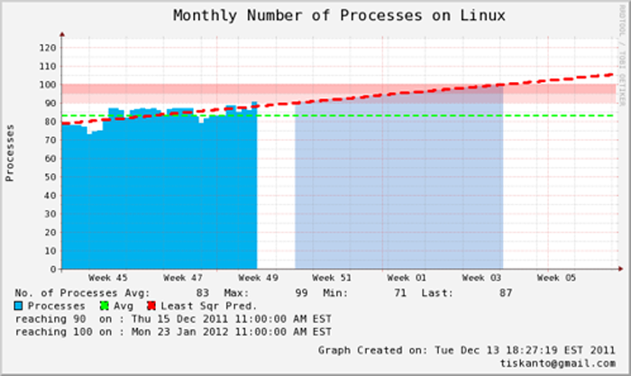
Following is the final result from the script:

As you can see from the above picture, using a least square method we can predict precisely when the process will hit 90 and 100. With this kind of method, we can forecast growth of a system and hence proactive measures can be taken before it becomes a problem.
¶ Trend Prediction using a non-linear data set
For a non-linear data set, there are several curve-fitting methods that can be used. However, the one that is being used by RRD is based on the average values (the method is called 'sliding window average'). There is a catch for this method however since this method is using a 'sliding window average value' then this prediction is only valid for up to several days. The reason being is an average data will get 'skewed' throughout the time and by then the prediction is no longer precise or valid anymore. For a more thorough prediction, a polynomial method might be needed which is not being supported by RRD at the moment.
The details of how this method works can be read at this documentation (look for the 'PREDICT' and 'PREDICTSIGMA' function). The way these functions work are as followed (again in CDEF notation):
CDEF:predict_value = time, n, window, x, PREDICT
where:
time and n are the number of time slots in seconds that needs to be 'shifted' backward from t=0
window is the number of seconds where the sliding window average will be calculated from
x is the actual data being predicted
so for example a statement like this :
CDEF:predict_value = 86400, 7, 900, x, PREDICT
would mean, data prediction will be calculated based on the past 7 days ( 24hrs x 7 ) with each value average will be calculated based on the data at 15 minutes window.
Note :
86400 is equal to 60 seconds x 60 minutes x 24 hour
900 is equal to 60 seconds x 15 minutes
The syntax for PREDICTSIGMA is the same as PREDICT.
To see how this function works please look at the following script, also please bear in mind that for the purpose of this example, I won't be plotting the PREDICTSIGMA because it is only being used to calculate the 'upper' and 'lower' values of the prediction on the actual data.
1: #!/bin/sh
2: rrdtool graph test123.png \
3: --imgformat=PNG \
4: --start=-1w \
5: --end='+1w' \
6: --title="Monthly CPU Util. on test123" \
7: --font TITLE:12: \
8: --units-exponent=2 \
9: --vertical-label="CPU Util." \
10: --height=250 \
11: --width=600 \
12: DEF:a="test123.rrd":5min_cpu:AVERAGE:step=300 \
13: DEF:a1="test123.rrd":5min_cpu:MAX:step=300 \
14: DEF:a2="test123.rrd":5min_cpu:MIN:step=300 \
15: DEF:a3="test123.rrd":5min_cpu:LAST:step=300 \
16: CDEF:idle=a,0.00,EQ,INF,0,IF \
17: CDEF:smooth=a,1800,TREND \
18: CDEF:predict=86400,-7,900,a,PREDICT \
19: CDEF:sigma=86400,-7,900,a,PREDICTSIGMA \
20: VDEF:avg=a,AVERAGE \
21: GPRINT:a:AVERAGE:"CPU Util Avg\: %8.0lf" \
22: GPRINT:a1:MAX:"Max\: %8.0lf" \
23: GPRINT:a2:MIN:"Min\: %8.0lf" \
24: GPRINT:a3:LAST:"Last\: %8.0lf\n" \
25: AREA:a#00B2EE:"CPU Util\n" \
26: AREA:idle#AFEEEE \
27: LINE2:avg#00FF00:"Avg\n":dashes=5 \
28: LINE2:predict#FF00FF:"Trend Prediction\n":dashes=5 \
29: LINE1:smooth#FF0000:"Sliding Window Smoothing": \
30: COMMENT:"\s" \
31: COMMENT:"Graph Created on\: `date sed -e 's/:/\\\:/g'`\r" \
32: COMMENT:"tiskanto(at)gmail(dot)com\r"Again as has been described before, the only interesting part from the script is only located on these lines, whereas the other parts are just simply ‘cosmetics':
17 CDEF:smooth=a,1800,TREND \
18 CDEF:predict=86400,-7,900,a,PREDICT \Line 17, is a TREND function that will create a half-hour sliding window average on 'a'
Line 18, the prediction will be calculated based on a 7x24 hr past data where the sliding window average will be calculated based on a 15-minute interval.
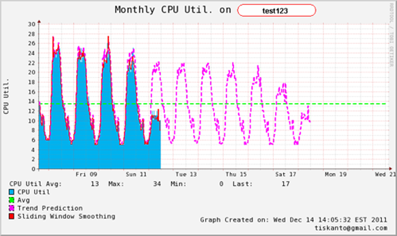
Following is the final result from the script.

If you look more closely at this graph, the prediction is able to predict accurately the 'Saturday' and 'Sunday' trends. This can easily be notified by the 'peaks' on 'Saturday' and 'Sunday' on the extrapolated line.
¶ One Last Thing
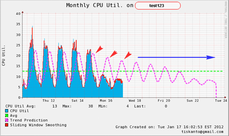
Remember that previously we discussed that this 'sliding window average' method can only be 'trusted' or 'valid' only for certain days due to the method being used. Any data that is using an average value will get 'skewed' throughout time. The same thing happens to this method and we will prove and show this to you by modifying the 'sliding window' value on the PREDICT function and try to see how it behaves.

As can be seen above the prediction value gets 'skewed' simply by increasing the sliding window value. The prediction trend will 'move' towards the total average as time goes by (total average is described in green).
¶ Conclusion
Trend prediction and capacity planning especially in IT is sometimes a complex issue but this can be done easily given that the user knows how to use the tools effectively. As explained before, you don't need to be very good at statistics to be able to create a good and decent trend prediction on your system. RRDTool which has become the standard de-facto for graphing in IT can do this job as good as other off-the-shelf commercial mathematical tools, --to some degree of course--. With a relatively short learning curve, a user who is already familiarized with RRD can change this little tool into a very powerful and useful one and not just for plotting.